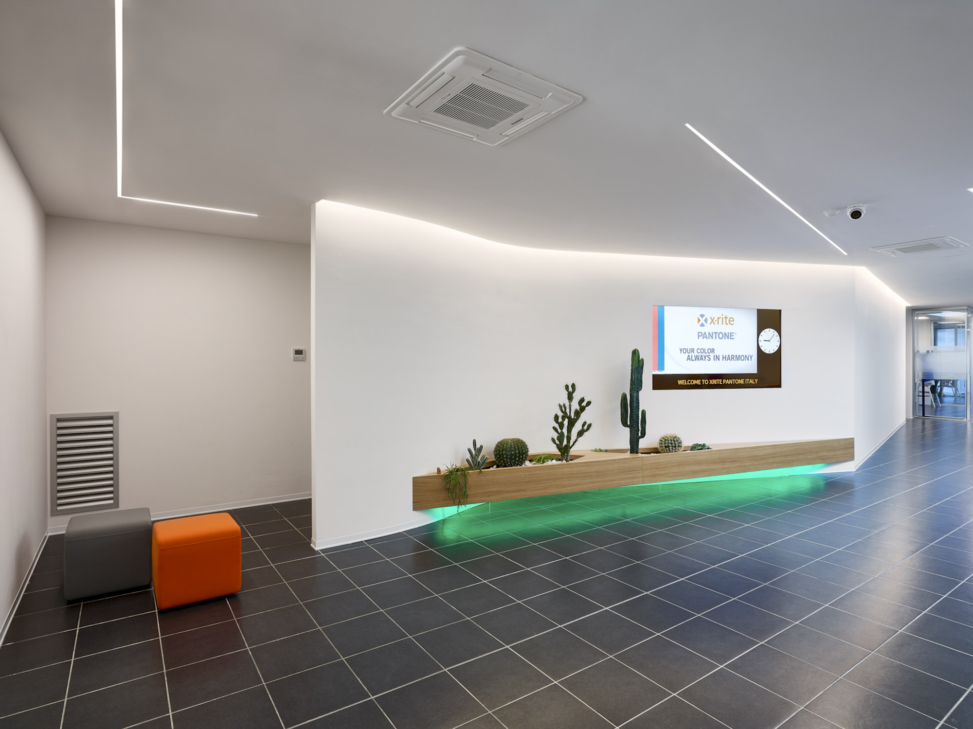
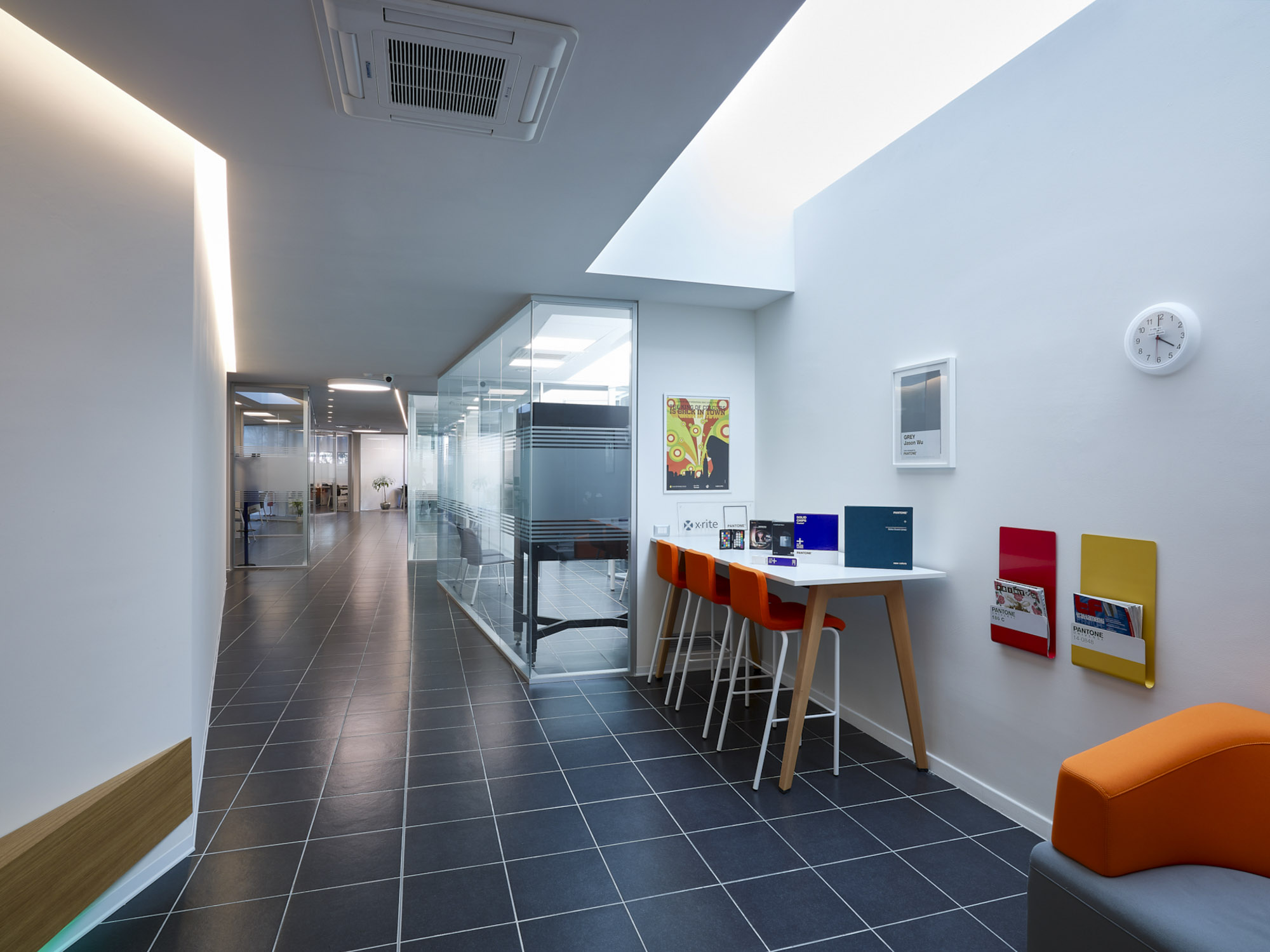
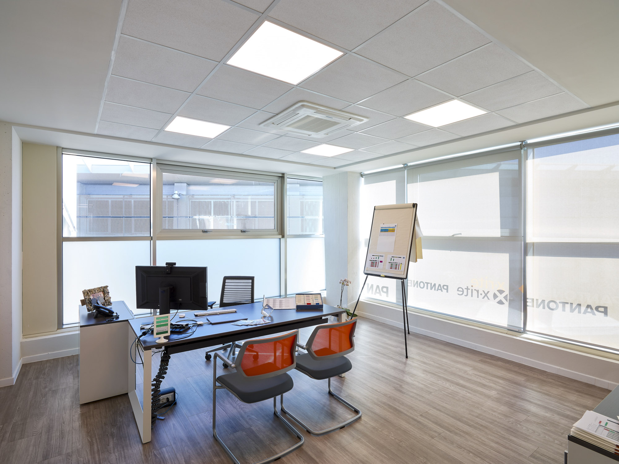
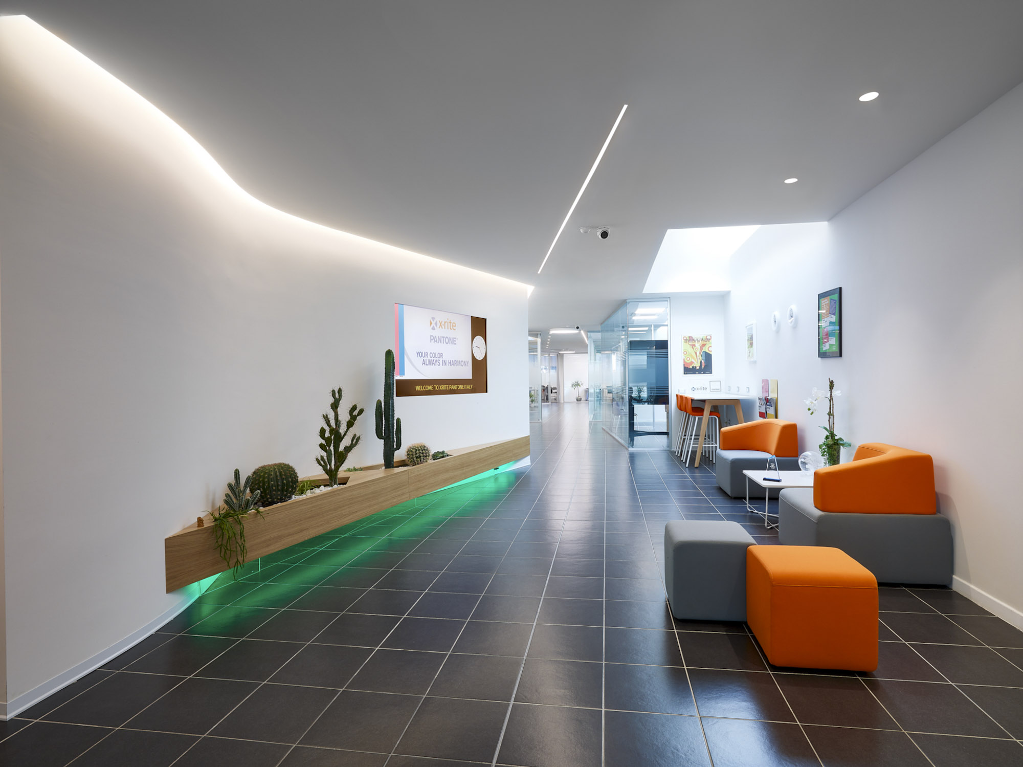
The X-Rite Pantone offices project represents an interior design intervention that translates the corporate identity linked to the world of color into contemporary workspaces characterized by vibrant chromatic accents and refined technical solutions. The environments develop across an entire executive floor where the neutrality of main surfaces dialogues with strategic color inserts that celebrate the company's core business in color management and standardization.
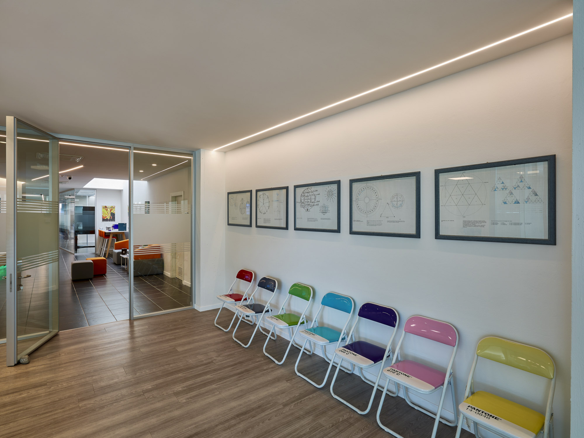
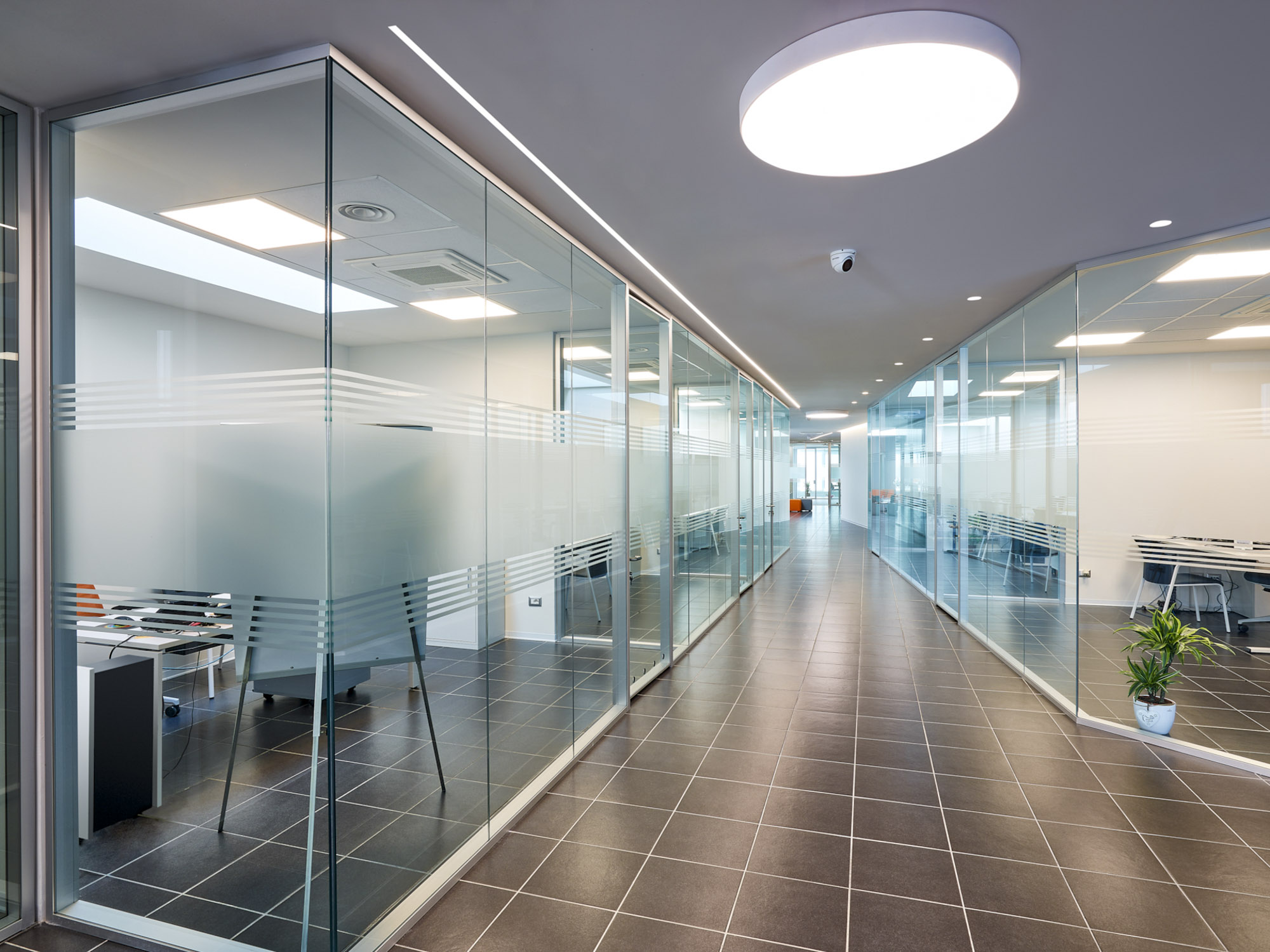
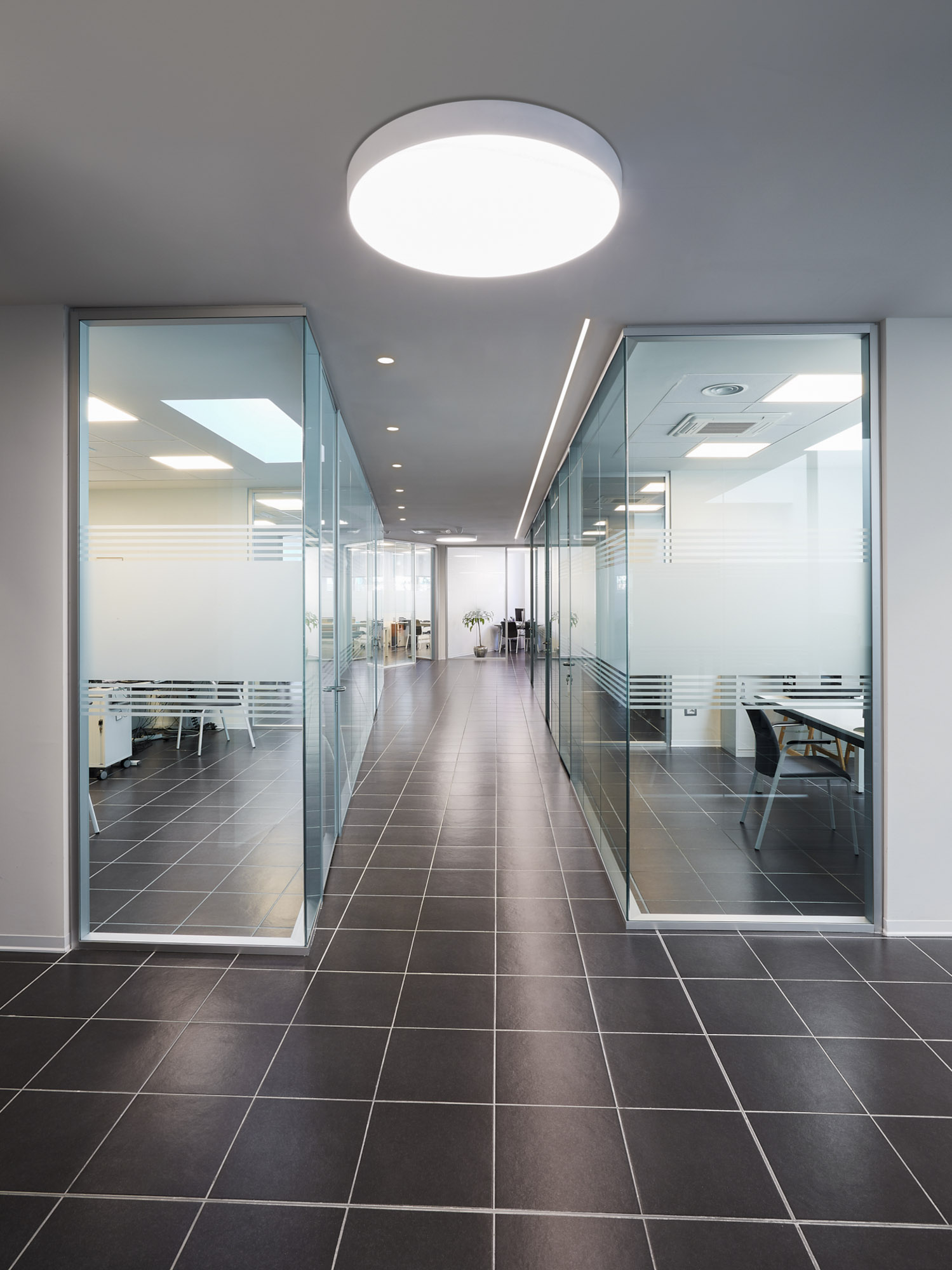
The distribution corridors are configured as scenic spaces characterized by dark gray porcelain stoneware flooring with stone effect creating a neutral and sophisticated backdrop, while immaculate white walls enhance the brightness of the environments. The distinctive element is represented by linear LED lighting integrated into the false ceiling that draws continuous luminous strips along the paths, creating dynamic graphic effects and ensuring uniform diffused lighting. Some walls feature cement gray finishes that introduce material texture and visual depth.
Common areas and lounge spaces distinguish themselves through bold use of color: a reception characterized by a linear desk clad in brilliant emerald green creating immediate visual impact at the entrance, vibrant orange seating arranged in informal compositions punctuating waiting spaces, multicolored chairs in primary tones (red, blue, yellow, green, purple) aligned along neutral walls as a functional artistic installation recalling Pantone color swatches. Furnishings with contemporary essential lines feature ergonomic seating with chrome structures and colored upholstery creating decisive chromatic contrasts.
Meeting rooms present different configurations: from the main boardroom with long white table surrounded by orange ergonomic seating facing large windows offering natural light, to smaller meeting rooms with organic-shaped tables and colored chairs arranged in collaborative configurations. Glass partitions with gray aluminum frames define spaces while maintaining visual transparency, while some surfaces feature frosted films ensuring partial privacy while allowing light passage.
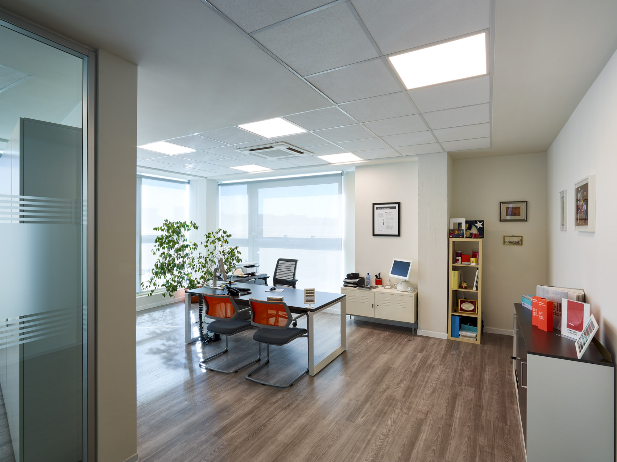
Operational offices are configured as bright open spaces with workstations characterized by linear white desks, black ergonomic seating, and coordinated storage. Large perimeter windows guarantee external views and flood environments with natural light, while white technical false ceilings with modular panels integrate square LED luminaires arranged in regular grids and incorporate air conditioning and fire prevention systems. Some areas feature natural parquet flooring introducing warmth and organic texture contrasting with the industrial surfaces of corridors.
Break and socialization zones are characterized by informal colored furnishings: high tables with primary red stools, modular orange poufs, green and blue seating creating chromatic islands in otherwise neutral spaces. Ornamental plants in white pots introduce natural elements improving environmental quality, while artworks and decorative graphics on walls personalize common spaces. Some corridors feature illuminated bulletin boards with corporate certifications and recognitions communicating professionalism and credibility.
Lighting is designed on multiple levels: abundant natural light from perimeter windows, diffused lighting from LED panels recessed in false ceilings, linear LED strips drawing paths and defining architectural geometries, and accent lighting enhancing specific elements such as reception and lounge areas. False ceilings present different configurations: modular white panels in operational areas, continuous gray ceilings in corridors with linear luminous inserts, and lowered solutions creating intimacy in specific zones.
The material palette remains essential, privileging neutral surfaces (white, gray, black) as backdrop against which saturated chromatic accents emerge, recalling the Pantone universe. Selected materials range from stone-effect porcelain stoneware in corridor flooring to natural parquet in offices, from smooth white walls to textured cement gray surfaces, from transparent and frosted glass partitions to chrome metallic elements in furnishings. Construction quality manifests in precise joints, coordinated finishes, and discrete integration of technical systems.
The X-Rite Pantone project distinguishes itself for its ability to translate corporate identity linked to color into architectural spaces that celebrate chromaticism through strategic inserts on neutral backgrounds, creating professional environments that balance operational seriousness with distinctive personality. Spaces communicate technical precision and attention to detail characteristic of the brand through calibrated design choices, high execution quality, and conscious use of color that is never casual but always intentional and meaningful, reflecting the corporate mission of color standardization and management at a global level.
"There is no better designer than nature."
4517 Washington Ave. Manchester, Kentucky 39495
ponte@studio.net
By clicking “Accept All Cookies”, you agree to the storing of cookies on your device to enhance site navigation, analyze site usage, and assist inour marketing efforts.